
Simple imagery fundamentals. What are the important things to think about when choosing images for your website, Facebook, Instagram etc?

First think about colour. You might have a warm colour pallet (colours yellow through to crimson) or a cool pallet (purple through to green). There is lots of information on choosing your colour scheme and using the psychology of colour to maximise your brand in your industry. This is one of many of you to look at if your are really interested “How to use the psychology of colour”.
How does this relate to your images? Is your brand bold bright or more muted? Your images should match or compliment your brand on your website and things like your banners at the top of Facebook or Twitter. They should continue to convey your brand to your prospective clients. If you use Instagram then think about choosing one filter as it does a similar thing, but there are a lot of other things to talk about on Instagram, so I’ll tackle it in a separate blog.
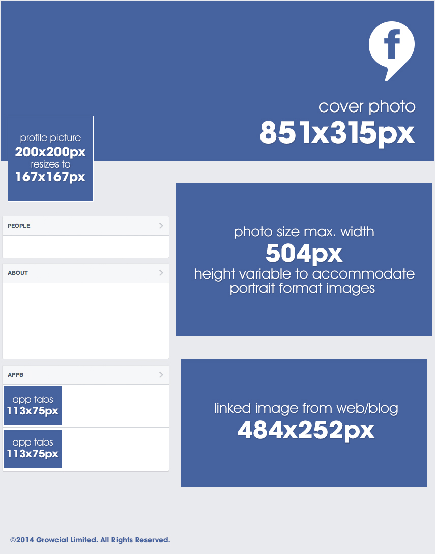
Second thing to think about is shape. Do you have large images that tex scrolls across, wide banners, square tiles, long drop down banner type images? The dimensions of your images are important as the rule of thirds (see previous post) is also a good guide, but as the dimensions change you have to visualise how that effects our composition. Here are the dimensions for Facebook to give you an idea of what I’m talking about, but this is equally true for blogs etc.
Okay I lied it’s not that simple…that’s why photographers ask you for money. It’s not just having a camera and taking nice pictures. However if your keen to have a go and are short of money thinking about colour and shape is a good place to start when branding your business.

Another fab blog thanks Claire – I get so much out of reading them